Posts

“Purple Prose”

Image
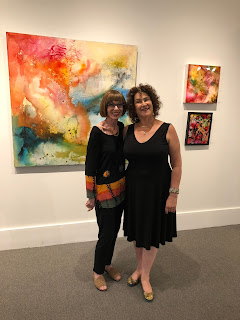
 This month I hosted another writing group created and run by my dear friend Zee Zahava, who brings small groups to the gallery to respond to the current show- not a critique of the work but a response to how the pictures make them feel. It is such a privilege to share in these visions. This is Zee’s short art/fiction story of coming to Ithaca- standing in front her favorite picture of the month.  It was late August, 1968, and the drive from our apartment in the Bronx, up to Quarry Dorm in Ithaca, was long. Longer than it would be for any other family. My father was nervous. He had to stop and pee at every rest stop. Also, he had to smoke a cigar, each time we stopped. My mother was unusually quiet. Each time dad got out of the car mom would turn around in her seat to ask if I was okay. I always said that I was. But was I? I had no idea.   I was bundled into the back seat with my guitar, my new electric typewriter, a not-very-good record player, and all my albums: Joni, L...

Sharing Responses to the work

Image
From artists and non artists alike. I am so lucky to have a dear friend, Zee Zahava, who is THE best facilitator of informal writing groups I’ve ever known. Over the last few years she’s convenes small groups to respond to the work on the walls- not what it means, but what it reminds them of, or how it makes them feel. This last Wednesday felt particularly resonant.I’m going to share a photo of the painting and what these women wrote. I hope you enjoy as much as I did! Here is Katrina Morse, a well-known artist and educator in Ithaca. August 21, 2024 Katrina Morse Response to “Arrival”  Can we be in a pink, orange, lighthearted mood and also in a black, blue, and crusty one --- at the same time? Or maybe it’s not exactly at the same time but alternating by the moment, or hour, or day. Each mood available to tap into as needed. Planes of existence, past experience, current situations. Certainly there are more moods than just two. The nuances of dark becoming light and back to dark a...

“Easter Egg” in summer!

Image
I was so pleased to be alerted to an article in Buffalo Rising newspaper which was a complete surprise. A local art mover and shaker noticed that my brother Symon had hung a Giclee print of koi from years ago on his balcony wall in the heart of Elmwood Village. The reviewer was very taken with the idea of displaying personal art for the public. I wrote him a note saying that my brother and I were following in our father’s footsteps. He updated the article, and voila! Text and pictures below. https://www.buffalorising.com/2020/07/buffalo-easter-eggs-ii/ A few days ago I posted on a special  Buffalo Easter Egg  that I came across during a walk in the Elmwood Village. Today I’m posting another Easter Egg in the form of a work of art adhered to the facade of a house. What I especially find interesting about this is that due to COVID-19, there is a dearth of art opportunities at hand. With shuttered galleries and studios, art does not abound as it once did. Therefore, public art ha...

Why this- why now?

Image
At a recent opening of my show in Rochester, one relatively sophisticated viewer pointed out that some of the paintings looked like they were by different people. The organic, textured, flowing, hot colored abstract landscape next to three muted, resin coated circles and dots bothered him.  Tenerife.  36x72   Specimens 30x30 Not me, though. Having come to painting late, I insisted on spending a few years going through many stages of representational rendering- flowers, fish, fruit, figures- and that’s just the ‘f’s- to prove to myself that I could. When I decided I had captured clouds and sunrises and the sea, I got rid of the horizon line- and I was painting abstractly, which had been my goal all along. Rather than experiment in style pastiche or stages I think I paint in paragraphs. A new idea emerges, it gets done again, different iterations, then I revisit what I had thought was finished. When this essay is finished, I move on. Mark Rothko ...

Crazy for color

Image
Red has always been one of my favorite colors, and I've been going to town lately. One is under resin which really makes it pop, but the completely inked painting also makes a statement. Trying to push winter away,  I guess.

Adding resin-magic!

Image
I’ve been having a great time experimenting with resin coatings for my ink and acrylic work. I started with birch boards as a base, which is recommended, but I’ve had success with both board and tightly stretched canvas. What I love is the way it makes colors pop! It certainly adds to the production of a piece in terms of time and technique, but it’s worth it. I use ArtResin, which is odorless and easy to mix up, though you DO have to heed the directions and wear shoes and gloves (sigh). I use a heat gun rather than a gas torch to run over the surface to remove bubbles, and seems to work. I’ve also had bad experiences using blue painter’s  tape on the sides, to keep small droplets from forming and hardening. Instead I go over the drips with gloved hands to get rid of them, then sand off the dried remainder with a circular sander. I still alternate between work with resin and paintings on raw canvas- tension between warmth that draws you in and a cool barrier through whic...

Departures and Arrivals

Image
So great to be showing in the luxurious space of Tim Brooks' new expo68 gallery in the Eastern Hills Mall this month. Tim has a great eye for display and quality- all good wishes on this exciting new venture. In the meantime, do stop by before September 7.